People have difficulties in receiving and sending money internationally.
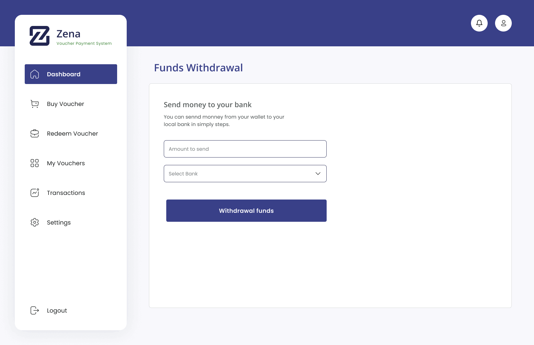
Zena is an International Voucher Payment System. It will solve the pain points our users face while trying to send and receive money internationally. It will also provide a non-platform restricted voucher market system, help users to redeem vouchers to their local currency, create online privacy for payment, and provide a cost-friendly application.
We plan on building an application with a good User Experience, an appealing User Interface and an interactive product. This way, Zena users will find the product usable, useful, enjoyable and equitable.
Challenges
People with and without bank accounts find it difficult when they receive and send funds internationally.
People find it difficult to redeem vouchers in their local currency.
Most voucher vendors are platform-restricted.
People are scared of uploading their payment details on online payment platforms.
Conversation rates of foreign currency to users’ local currency are usually on the high side.
High cost of sending money internationally.
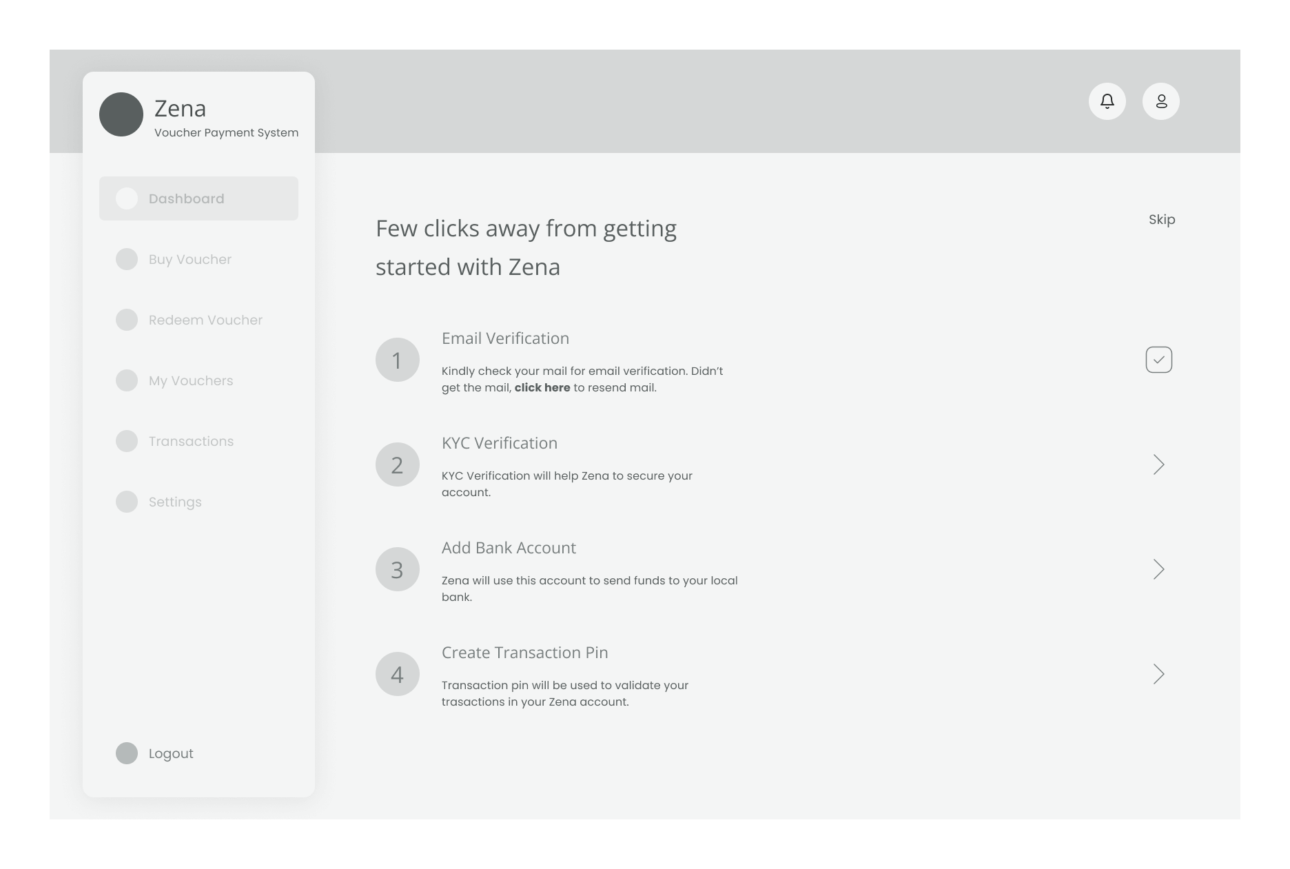
Getting Started
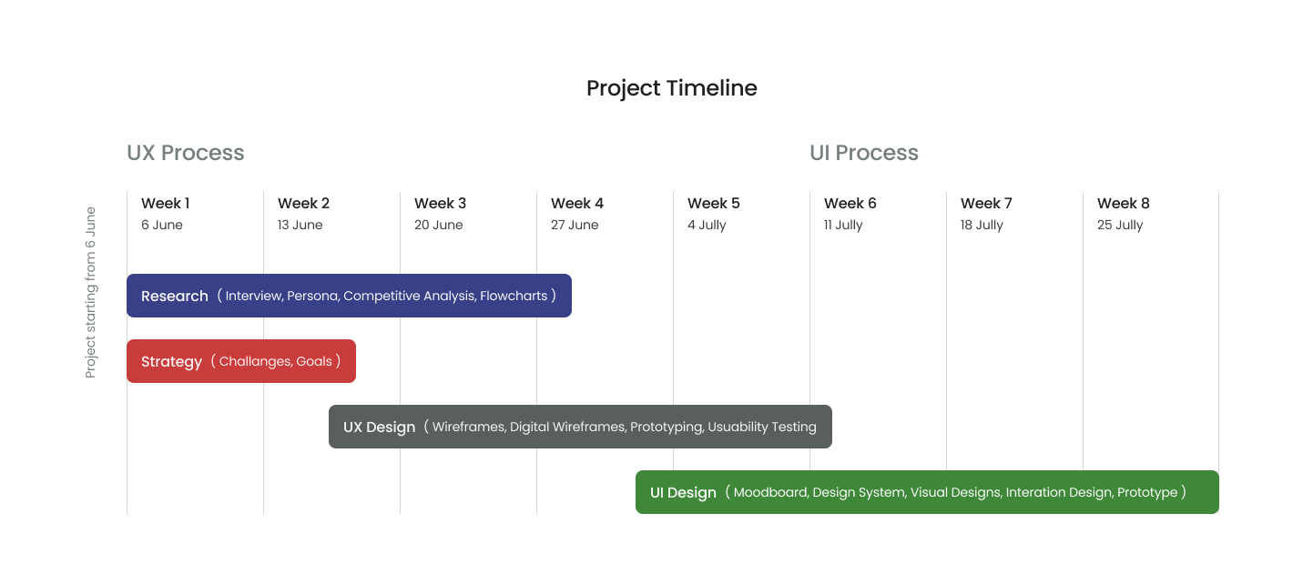
In Zena’s Design process, our team opted for a goal-directed design approach which helped us work through a timeline smoothly. We used Qualitative research methods to help us understand our users and their pain points.
Research
Interview
Zena users cut across people sending and receiving money across different countries and people who make online payments. We got this insight from Zena stakeholders. While recruiting participants, we recruited people who live in various countries and have performed transactions around sending and receiving money internationally or making payments online.
While preparing the interview brief, we made our questions open-ended questions. It enabled our participants to elaborate on their experience while carrying out the above transactions. At this stage, we were unbiased and open so that we could spot their frustrations.
The interviews with the participants were conducted virtually through Zoom and recorded for future analysis.
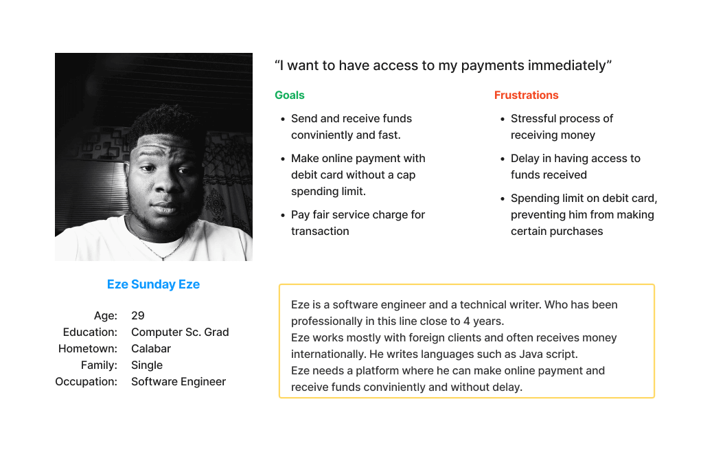
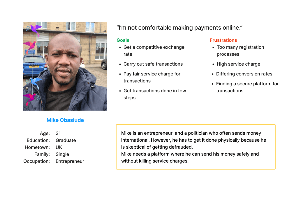
Persona Development
We went through our notes and the recordings from the interview. After analyzing these resources, we were able to understand the goals and frustrations of our users. Below are two common user groups.
Competitive Analysis
We were able to identify our competitors from Zena Stakeholders. Now we understand our targeted users, their goals and frustration, we then went ahead to conduct a competitive analysis. We were more focused on understanding how our competitors send money internationally, their security measures and transaction prices. Click here to see our findings and our recommendations to Zena stakeholders.
Flowcharts
For the team to better understand how we would build the core experience for Zena users, we had to design a user flowchart. It helped us to communicate the entries and exits point of the user, thereby focusing more on the user experience and the needs of the users.
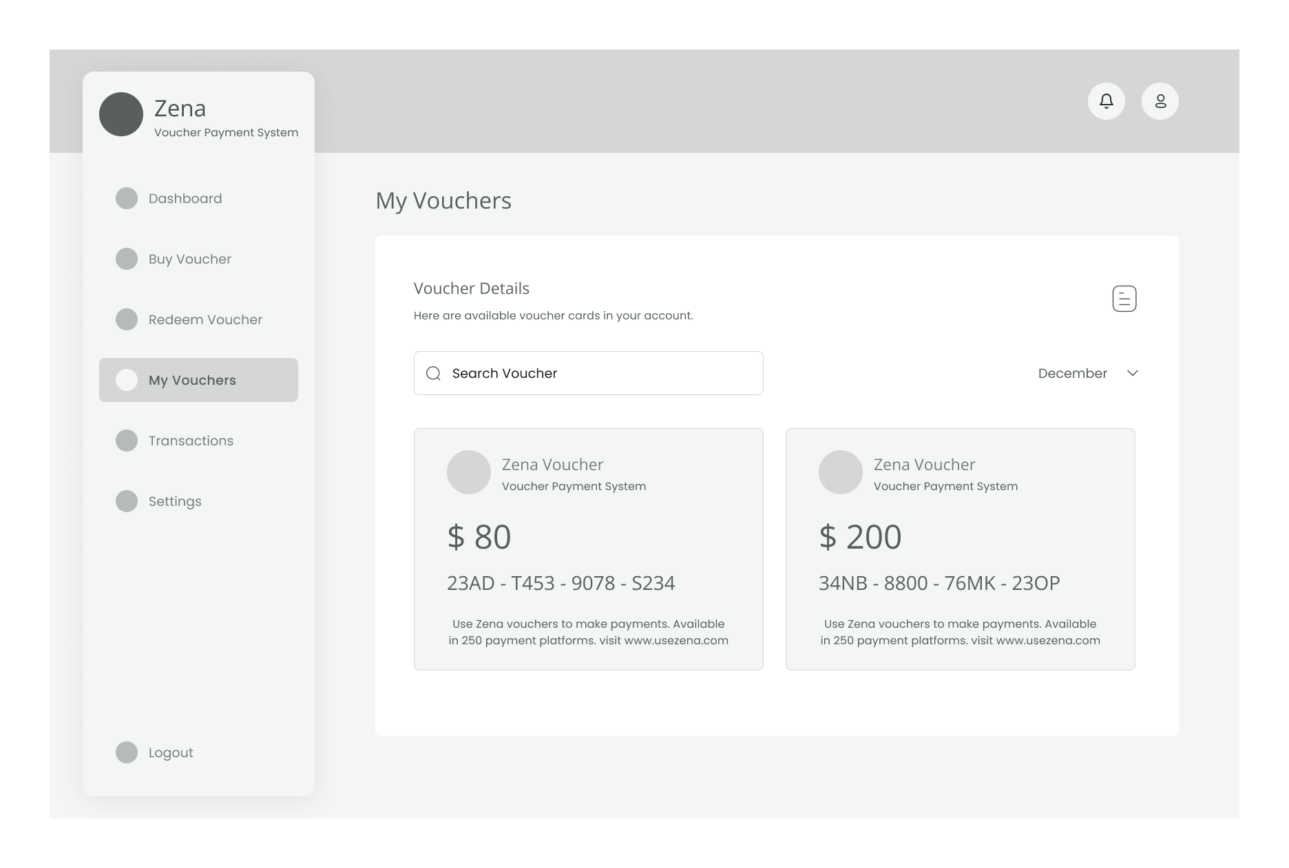
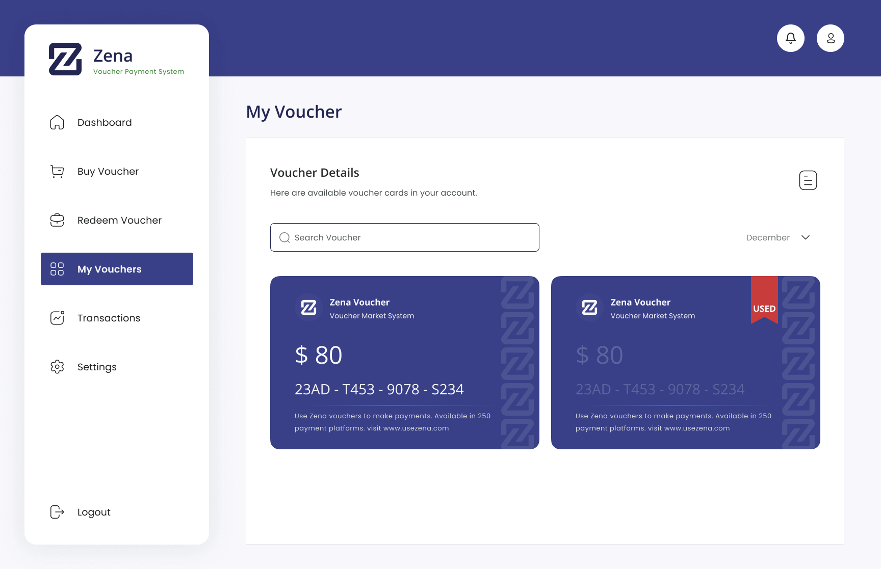
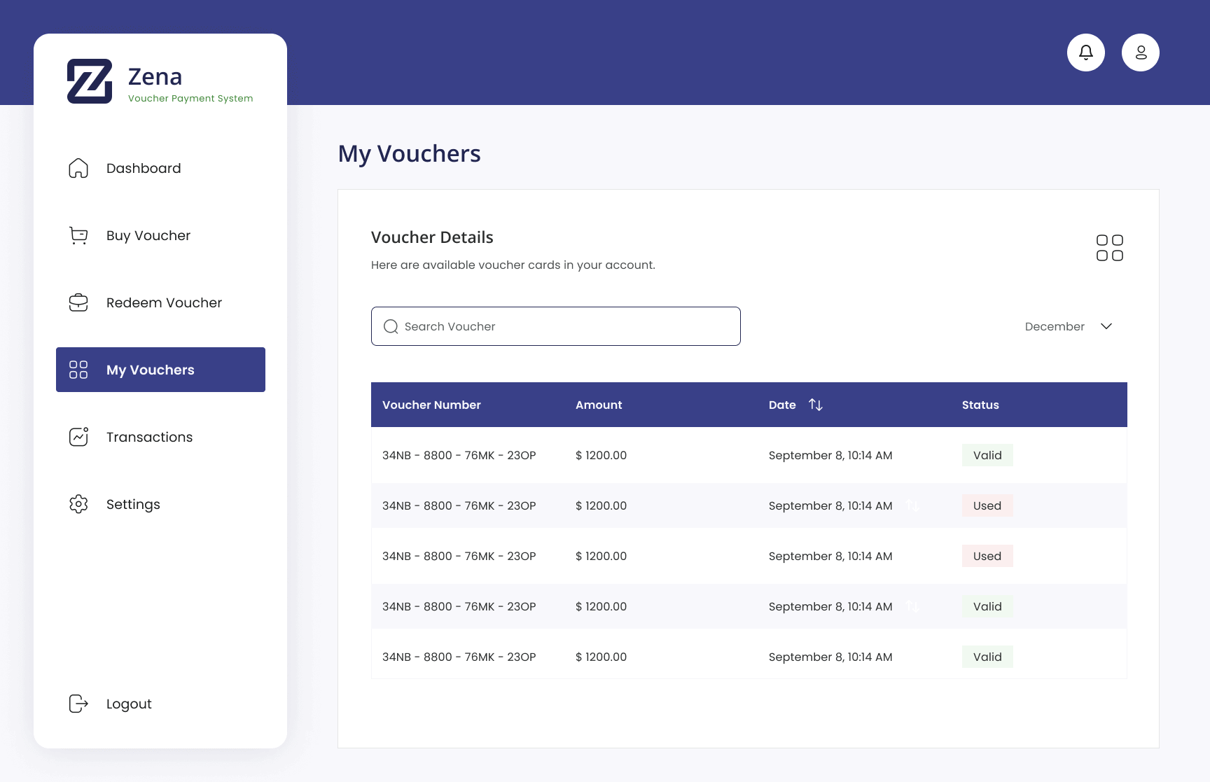
Creating Voucher
Redeeming Voucher
Sending Voucher
UX Design
Sketching Wireframes
At this stage, we kept in mind everything we had learned from our research – personas, their pain points, our competitive analysis, walkthrough and the user flows. So, the team started visualizing the solution and application by sketching concepts.
After the sketching, we got some feedback from the team and stakeholders before we commenced on high-fidelity design. concepts.
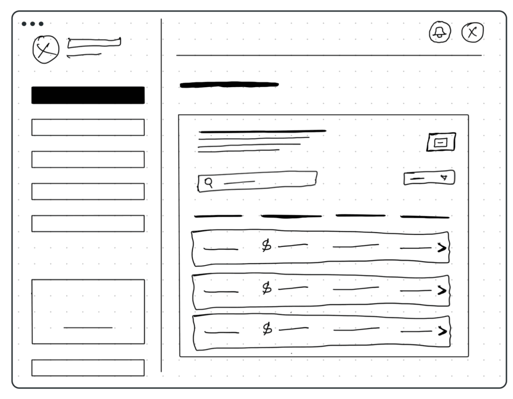
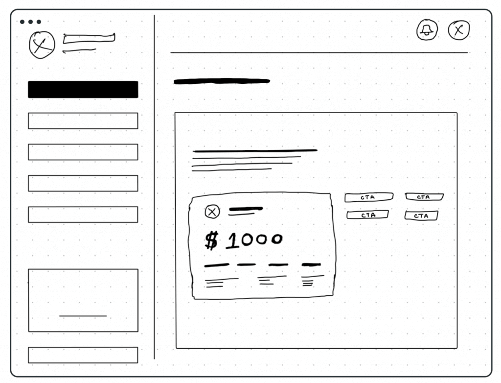
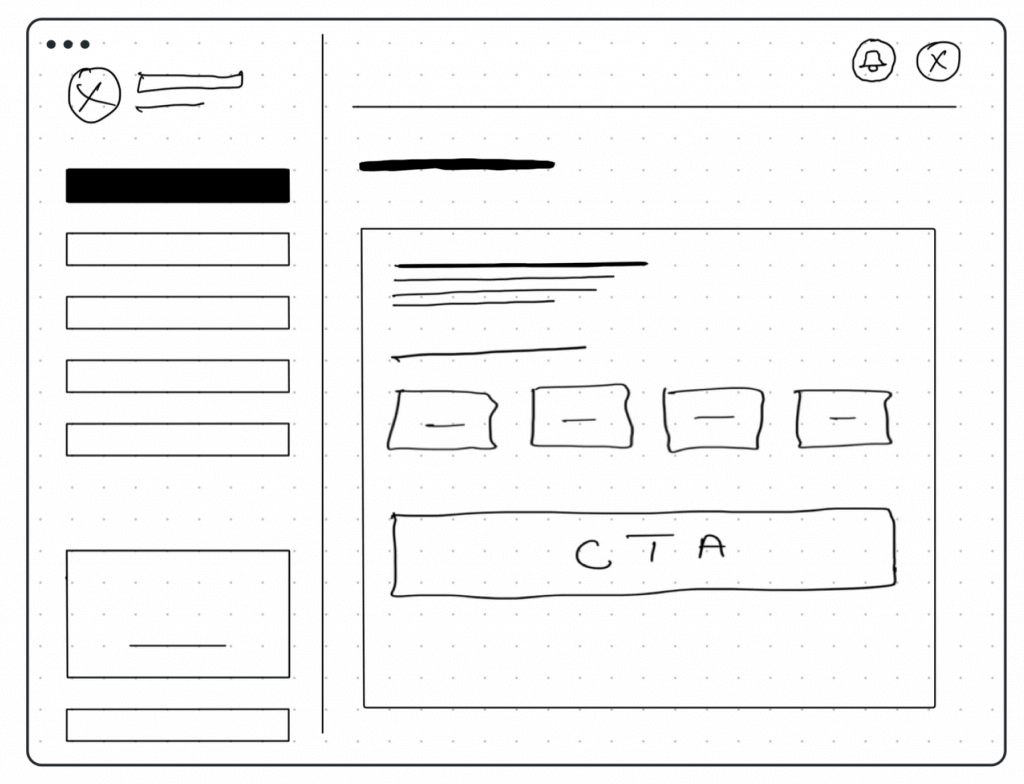
Digital Wireframes
At this stage, we wanted a more realistic version of our sketching, so we went on to design the digital wireframes. We also worked on some of the technical issues we noticed with the sketching and added copies for the project.
Things were getting exciting for the team and the stakeholders because we could feel the reality of the actual design at this stage.
Usability Testing
We conducted a usability test with several participants through our low-fidelity prototype. The aim is to help us to understand their interaction patterns and pain points using the system.
Each participant was given several tasks ranging from Buying and Redeeming Voucher, Registration and Onboarding, and Account Management.
Redefining Design
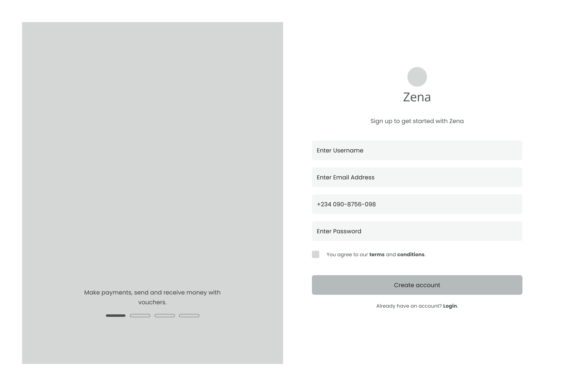
Mockups
Before commencing with the building of the mockups, we analysed the feedback gotten from our usability testing and implemented our findings to solidify the product.
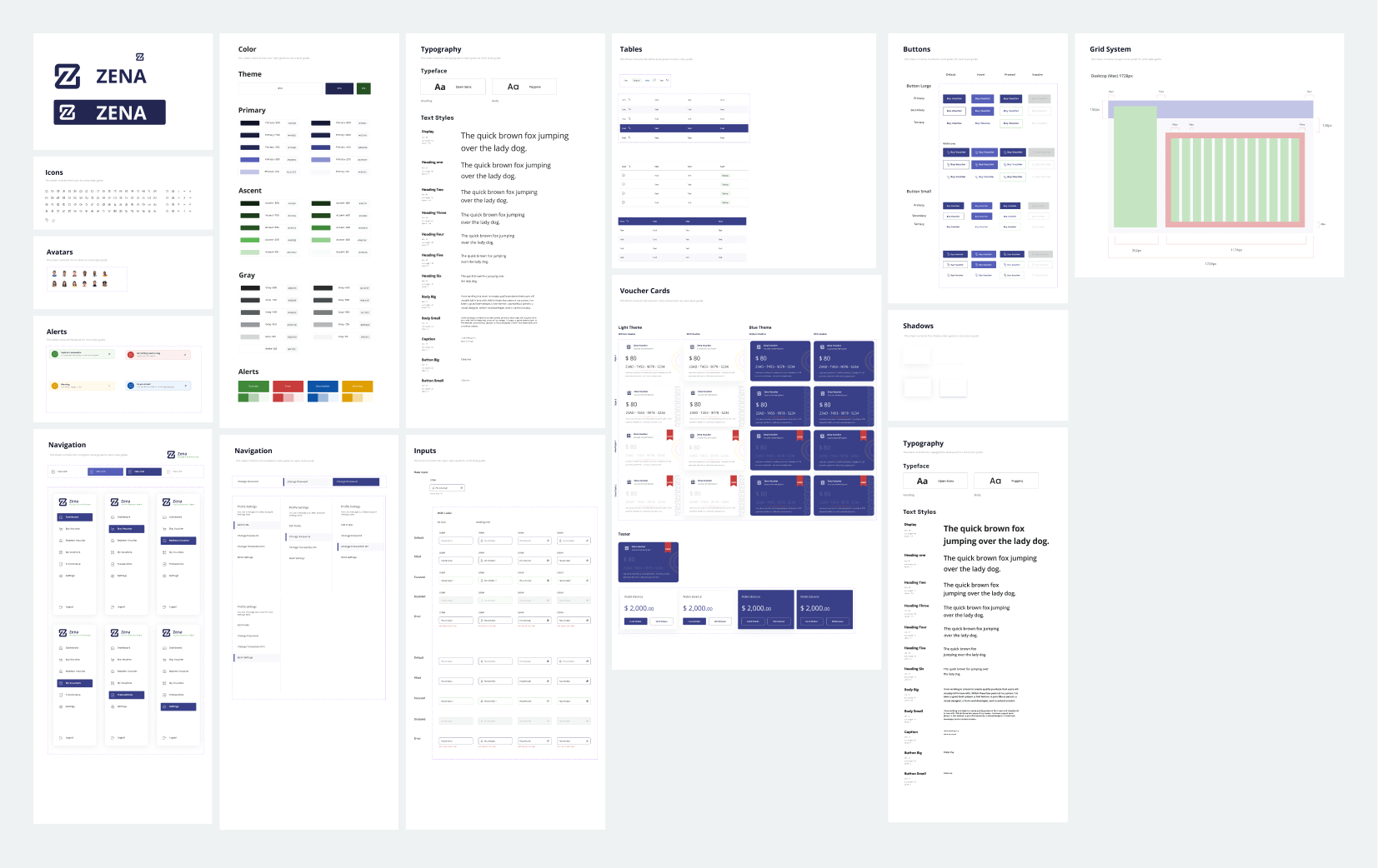
Then we created a mood board and a design system. The design system comprises our colours, typography, inputs, icons, navigations, buttons, etc. The design system helped our team to build the mockups faster and easier.
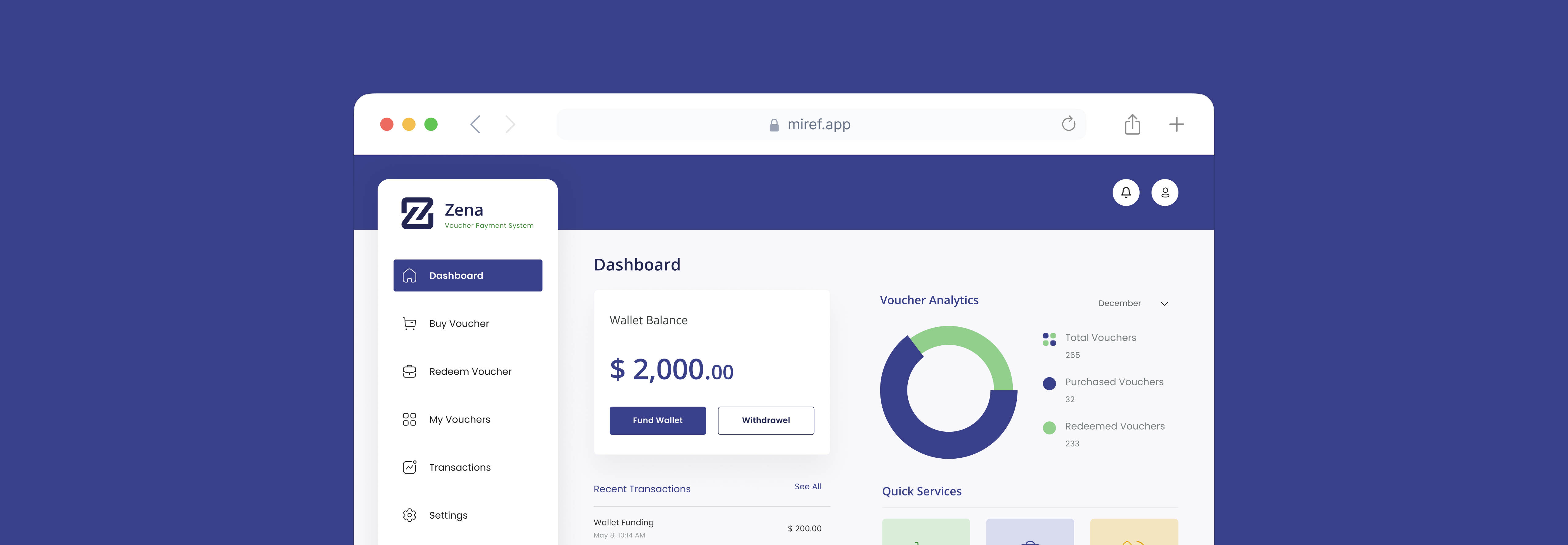
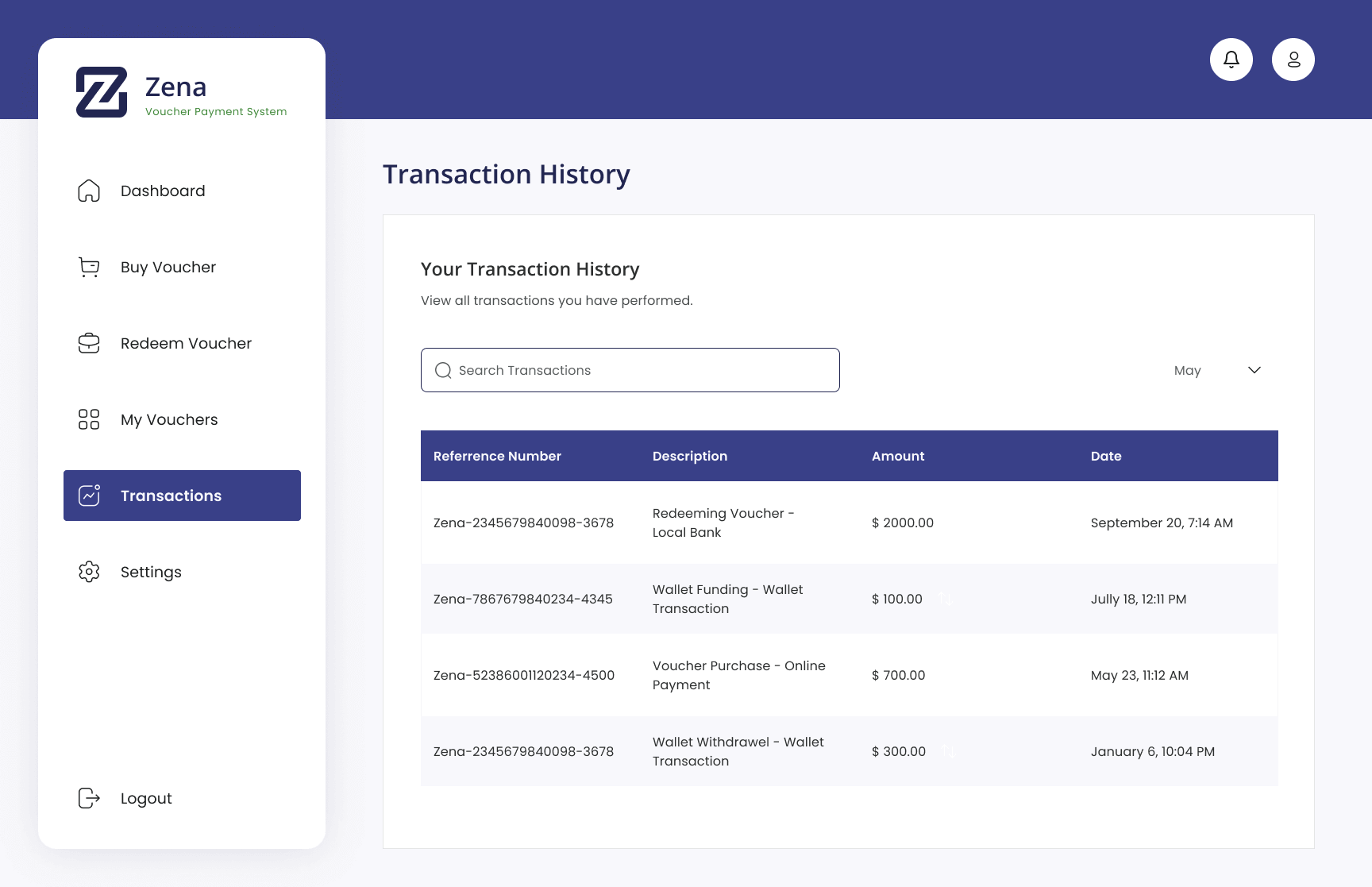
Final Design & Prototype
Prototype is best reviewed on desktop. If you are having any issues viewing this prototype, click on here.
Style Guide & Design System
Take Away
Some Challenges I Faced.
As much as we recorded success in this project, we had challenges as well. Due to time constraints, the research was based on the customer user group and did not cover the “Merchants”. So, for Zena, the Merchants’ design flow is vital, and we would also need to implement this part of the design.
Next Steps
Touch base with key stakeholders of the project to agree on an execution plan, communication channel, and review cadence among other modalities.
Developer Design Hand-off with Zeplin - we will work closely with our engineers to ensure a polished output.
We will also conduct A/B Testing before launching Zena. Making sure the success metrics are accomplished
While our engineers are working on the project, our team will continue designing other outstanding interactions, covering all possible scenarios using an Agile development workflow.
Setup tools like Hotjar to truly understand what users are doing. Make the necessary changes accordingly to what was observed and noticed as a problem.